| Settings | Description |
|---|---|
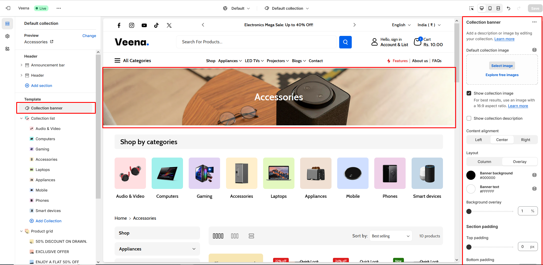
| Default collection image | Use "Default collection image" to add the image to the section. |
| Show collection image | Enabling this checkbox will allow you to display the added image in the collection. |
| Show collection description | Enabling this checkbox will allow you to display the added description in the collection. |
| Content alignment | Customization of "Content alignment" as follows:
|
| Layout | Customization of the "Layout" in the collection banner is as follows:
|
| Banner background | Modifying the color of the banner background will result in a corresponding color change for the banner background. |
| Banner text | Modifying the color of the banner text will result in a corresponding color change for the banner text. |
| Background overlay | By enabling this checkbox, you have the ability to change the opacity of the image overlay. Modify the "Background overlay" setting to increase or decrease the opacity level of the overlay on the collection banner image. |
| Settings | Description |
|---|---|
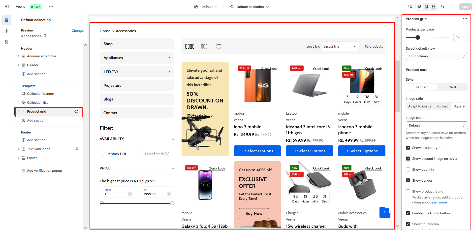
| Products per page | "Products per page" is to specify how many products to show in this page. You can show a minimum of “8” and a maximum of “24” products. |
| Select default view | Utilize these settings to select the columns for the product. "Select default view" in a section are as follows:
|
| Product card | Style The customization of the style in the product section are as follows:
Image ratio Product image customizations in a section are as follows:
Image shape
Show product type By enabling this checkbox you can “Show product type”. Show second image on hover Show quantity
|
| Variants | Show variants If the type is "Dropdown," then the variant would be dropdown. And if the type is "Pills," then the variant would be Pills. The variant types are as follows: Type:
Enable color swatches |
| Stock bar | "Stock countdown" is for customizing the product stock. Maximum stock Limit stock cut off Limit stock message In stock message Continue selling message |
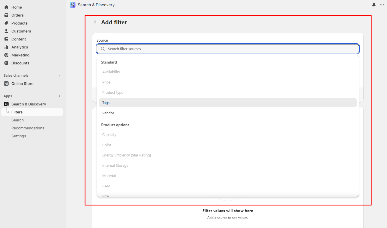
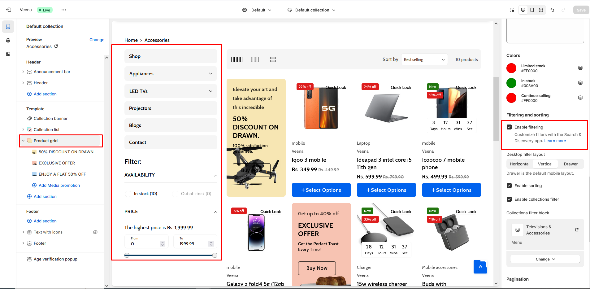
| Filtering and sorting | Enable filtering Desktop filter layout Product filter layout customizations in a page are as follows:
Enable sorting |
| Pagination | Pagination type Pagination type customizations in a page are as follows:
|
| Mobile layout | Number of columns on mobile "Number of columns on mobile" is used for the customization of product columns in Mobile devices.
|
| Block | Description |
|---|---|
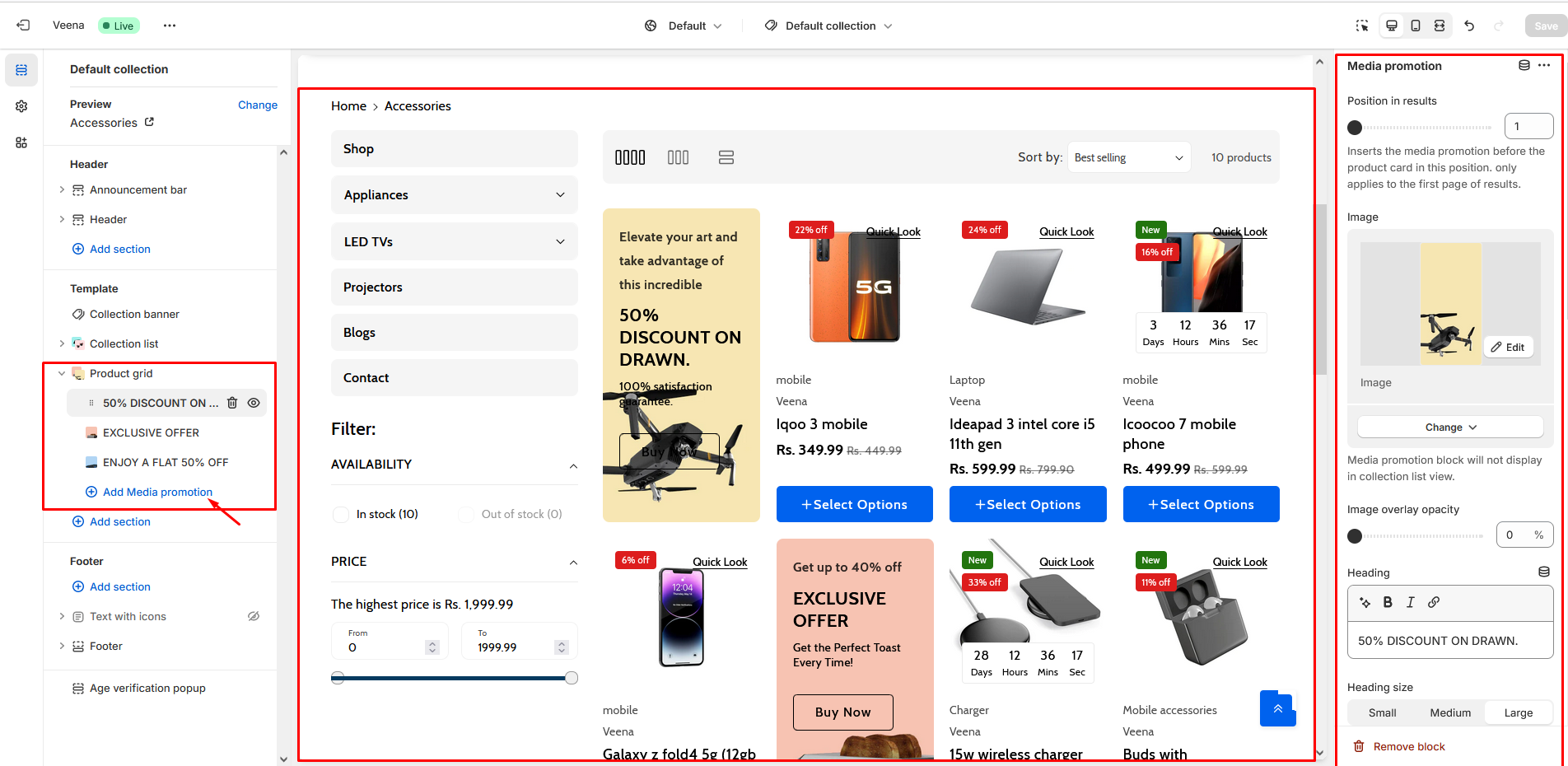
| Position in results | Inserts the media promotion before the product card in this position. only applies to the first page of results. |
| Image | Use "Image" to add the image to the section. |
| Image overlay opacity | By enabling this checkbox, you have the ability to change the opacity of the image overlay. Modify the "Image Overlay Opacity" setting to increase or decrease the opacity level of the overlay on the banner image. |
| Heading | Enter text to display as on the "heading" section. |
| Heading size | Following is the font size customization of the heading of the section:
|
| Sub heading | Enter text to display as on the "sub heading" section. |
| Description | Enter text to display as a "description" in the section. |
| Description style | Customization of the "Description style" in this section is as follows:
|
| Button label | Use "Button label" to add a label to the Button in the section. |
| Button link | Use "Button link" to add a link to the Button in the section. |
| Open this link in a new window | By using the "Open this link in a new window" option, the link will open in a new tab. |
| Button style | Customization of the "Button style" is as follows:
|
| Show container | When 'Show container' is enabled, the banner's content container box will be visible. |
| Container overlay opacity | By enabling this checkbox, you have the ability to change the container overlay opacity. Modify the "Container overlay opacity" setting to increase or decrease the opacity level of the overlay on the banner content. |
| Desktop content position | To change the position of the content on the banner, utilize the "Desktop content position" setting. Customization of the "Desktop content position" in this section is as follows:
|
| Desktop content alignment | Customization of "Desktop content alignment" in desktop devices is as follows:
|
| Color scheme | In this section, you can change the background and foreground color of a section using the color scheme.
|