# Product page

## Customize product page <a href="#productpage" id="productpage"></a>

You can sell goods, digital downloads, services, and gift cards through the product page. In addition, you can add a product to Shopify by entering product details and uploading product images. If your product has options, like size or color, then you can add a variant for each combination of options.

You can view, add, update, and organize all of your products and their variants from the "**Products page**" in the Shopify admin.

<table><thead><tr><th width="230">Settings</th><th>Description</th></tr></thead><tbody><tr><td>Enable sticky content on desktop</td><td>You can make the content sticky on a desktop device by checking this checkbox.</td></tr><tr><td>Media</td><td><p><strong>Desktop media width</strong><br>You will find customizations for adjusting the desktop media width within this section:</p><ul><li>Small</li><li>Medium</li><li>Large</li></ul><p><strong>Constrain media to screen height</strong><br>By enabling this checkbox, you can limit the height of media to the screen height.<br><br><strong>Media fit</strong></p><p>The Media fit customization setting is as follows:</p><ul><li>Original</li><li>Fill</li></ul><p><strong>Desktop layout</strong><br>Desktop layout customization setting is as follows:</p><ul><li>Stacked</li><li>2 columns</li><li>Thumbnails</li><li>Thumbnail carousel</li></ul><p><strong>Desktop media position</strong></p><p>The desktop media position customization setting is as follows:</p><ul><li>Left</li><li>Right</li></ul><p><strong>Image zoom</strong></p><p>The Image zoom customization setting is as follows:</p><ul><li>Open lightbox</li><li>Click and hover</li><li>No zoom</li></ul><p><strong>Hide other variants</strong><br>By enabling this checkbox, you can hide other variants’ media after selecting a variant.</p><p><br><strong>Enable video looping</strong><br>Enabling "Play video on loop" will result in the video continuously looping. When the video finishes playing, it will automatically restart.</p></td></tr><tr><td>Mobile layout</td><td><p><strong>Mobile layout</strong><br>Mobile layout customization setting is as follows:</p><ul><li>2 columns</li><li>Show thumbnails</li><li>Hide thumbnail</li></ul></td></tr></tbody></table>

## Add block

Following are the blocks you can add to your “Main product:”

<table><thead><tr><th width="272">Block</th><th>Description</th></tr></thead><tbody><tr><td>Text</td><td><p><strong>Text</strong><br>Enter text to display as a Discription in the "Text" block.<br><br><strong>Text style</strong></p><p>Customization of the "Text style" in the main product page is as follows:</p><ul><li>Body</li><li>Subtitle</li><li>Uppercase</li></ul></td></tr><tr><td>Title</td><td>Show product "Title" for your main product.</td></tr><tr><td>Product meta</td><td><p>"Product meta" is for customizing product vendor, type, and tags which are as follows:</p><ul><li>Show vendor</li><li>Show type</li><li>Show tags</li></ul></td></tr><tr><td>Image</td><td><p><strong>Image</strong><br>"Image" is taken into use to add an image banner in the product section.<br></p><p><strong>Image link</strong></p><p>Use the "Image link" to add a link to the image in the section.</p><p></p><p><strong>Image alignment</strong></p><ul><li>Left</li><li>Center</li><li>Right</li></ul></td></tr><tr><td>Stock bar</td><td><p>"Stock countdown" is for customizing the product stock.<br></p><p><strong>Maximum stock</strong><br>Adjust maximum the stock for the stock countdown. Maximum product stock can be given up to "200".<br></p><p><strong>Limit stock cut off</strong><br>Adjust the limited stock cut-off for the stock countdown.<br></p><p><strong>Limit stock message</strong><br>Display limit stock message.<br></p><p><strong>In stock message</strong><br>Display the "In stock" message.<br></p><p><strong>Continue selling message</strong><br>Display the "Continue selling" message.<br><br><strong>Colors</strong><br>Customize the colors of  Limited stock, In stock and Continue selling text.</p></td></tr><tr><td>Price</td><td>This block has no customizable settings. After adding this block, you will be able to view the product price.</td></tr><tr><td>SKU</td><td>Show product "SKU" for your main product.</td></tr><tr><td>Inventory status</td><td><p>The inventory status, indicating whether the product is in stock or out of stock.<br><br><strong>Text style</strong></p><p>Customization of the "Text style" is as follows:</p><ul><li>Body</li><li>Subtitle</li><li>Uppercase</li></ul><p><strong>Low inventory threshold</strong><br>This feature defines that if the number of products in stock falls below a certain threshold in the product range, a 'low stock' text will be displayed.<br><br><strong>Show inventory count</strong><br>By enabling this checkbox, you can show inventory count.</p></td></tr><tr><td>Variant picker</td><td><p>"Variant picker" is to customize the product variant.<br></p><p><strong>Type</strong><br>The variant type is given below. If type "Dropdown" then the variant would be dropdown. and if the type is "Pills" then the variant would be pills.</p><ul><li>Dropdown</li><li>Pills</li></ul><p><strong>Enable color swatches</strong><br>By enabling this checkbox you can show the "Variant color."</p></td></tr><tr><td>Buy buttons</td><td><p><strong>Enable the Show dynamic checkout buttons</strong> box to display any dynamic checkout options enabled by you in your payments settings.<br></p><p><strong>Enable the Show recipient information form for gift card products</strong> box to display gift recipient form</p></td></tr><tr><td>Description</td><td>After adding this block, you will be able to view the product description.</td></tr><tr><td>Share</td><td>Clickable text that allows customers to share the product on social media.</td></tr><tr><td>Share button</td><td><p>Enabling the checkbox below will display the share button.</p><ul><li>Share on Facebook</li><li>Tweet on Twitter</li><li>Pin on Pinterest</li></ul></td></tr><tr><td>Custom Liquid</td><td>Add Apps.</td></tr><tr><td>Content</td><td><p><strong>Title</strong></p><p>Enter text to display as a title in the section.<br></p><p><strong>Content</strong></p><p>Enter text to display as a "Description" in the section.<br></p><p><strong>Content from the page</strong></p><p>"Select page" is for selecting a page in a section.</p></td></tr><tr><td>Trust content</td><td><p><strong>Heading</strong><br>Enter text to display as a title in the "Trust content" block.<br></p><p><strong>Payment methods :</strong></p><p>Show payment icons: By enabling this checkbox you can show the “Payment icon”.<br></p><p><strong>Heading</strong><br>Enter text to display as a title in the section.</p><p><br><strong>Description</strong><br>Enter text to display as a "Description" in the section.<br></p><p><strong>Security :</strong></p><p><strong>Heading</strong></p><p>Enter text to display as a heading in the section.<br></p><p><strong>Image</strong></p><p>Use "Image" to add the image to the section.<br><br><strong>Image width</strong><br>"Image width" is used to change the size of the section image. You can give the minimum width "100" and maximum width "600" of the image.</p></td></tr><tr><td>Collapsible row</td><td><p>The section "Collapsible row" is for adding collapsible rows.<br></p><p><strong>Heading</strong></p><p>Enter text to display as a title in the "Collapsible row" block.</p><p></p><p><strong>Icon</strong></p><ul><li>None</li><li>Flash sale</li><li>Apple</li><li>Banana</li><li>Bottle</li><li>Box</li><li>Carrot</li><li>Chat bubble</li><li>Check mark</li><li>Clipboard</li><li>Dairy</li><li>Dairy free</li><li>Dryer</li><li>Eye</li><li>Fire</li><li>Gluten free</li><li>Heart</li><li>Iron</li><li>Leaf</li><li>Leather</li><li>Lightning bolt</li><li>Lipstick</li><li>Lock</li><li>Map pin</li><li>Nut free</li><li>Pants</li><li>Paw print</li><li>Pepper</li><li>Perfume</li><li>Plane</li><li>Plant</li><li>Price tag</li><li>Question mark</li><li>Recycle</li><li>Return</li><li>Ruler</li><li>Serving dish</li><li>Shirt</li><li>Shoe</li><li>Silhouette</li><li>Snowflake</li><li>Star</li><li>Stopwatch</li><li>Truck</li><li>Washing</li></ul><p><strong>Row content</strong></p><p>Enter text to display as content in the row. <br></p><p><strong>Row content from page</strong><br>By using these settings, the selected page will display its content like row content.</p></td></tr><tr><td>Offer</td><td><p><strong>Heading</strong><br>Enter text to display as a title in the "Offer" block.<br><br><strong>Icon</strong></p><ul><li>None</li><li>Flash sale</li><li>Apple</li><li>Banana</li><li>Bottle</li><li>Box</li><li>Carrot</li><li>Chat bubble</li><li>Check mark</li><li>Clipboard</li><li>Dairy</li><li>Dairy free</li><li>Dryer</li><li>Eye</li><li>Fire</li><li>Gluten free</li><li>Heart</li><li>Iron</li><li>Leaf</li><li>Leather</li><li>Lightning bolt</li><li>Lipstick</li><li>Lock</li><li>Map pin</li><li>Nut free</li><li>Pants</li><li>Paw print</li><li>Pepper</li><li>Perfume</li><li>Plane</li><li>Plant</li><li>Price tag</li><li>Question mark</li><li>Recycle</li><li>Return</li><li>Ruler</li><li>Serving dish</li><li>Shirt</li><li>Shoe</li><li>Silhouette</li><li>Snowflake</li><li>Star</li><li>Stopwatch</li><li>Truck</li><li>Washing</li><li>Tag</li></ul><p><strong>Content</strong><br>Enter text to display as a content in the section. Use of this feature you can share information about your brand with your customers.<br><br>Customize the tag Icon color.</p></td></tr><tr><td>Pop-up</td><td><strong>Link label</strong><br>Enter text to display as a title in the "Link label" block.<br><br><strong>Page</strong><br>By using these settings, the selected page will display its content in pop-up.</td></tr><tr><td>Product rating</td><td>Displays the average product rating in stars with the number of reviews in parenthesis
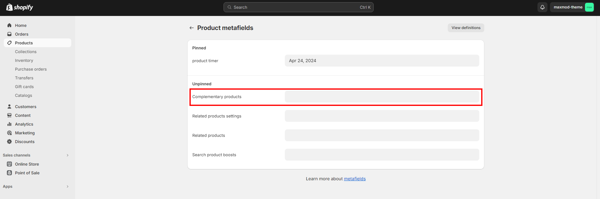
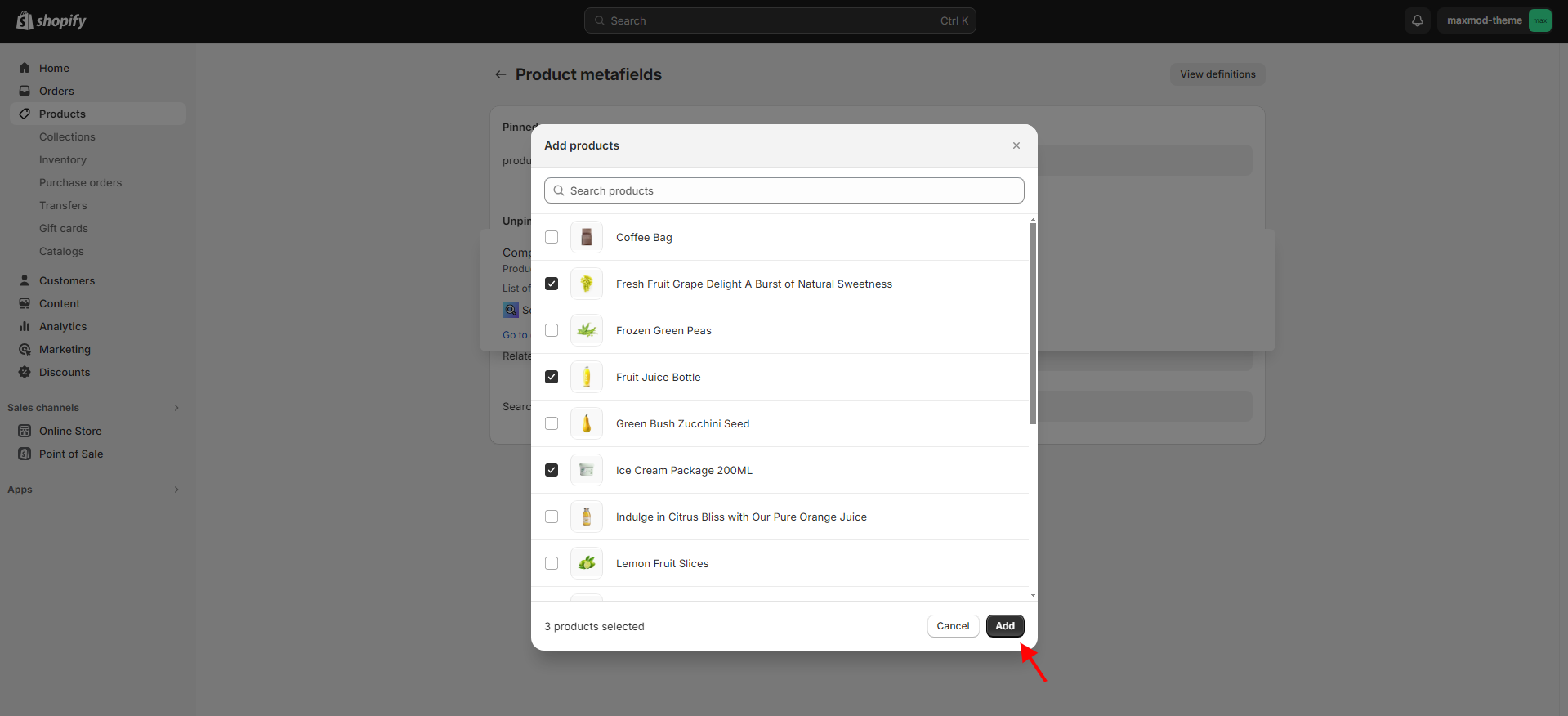
</td></tr><tr><td>Complementary products</td><td><p><strong>Heading</strong><br>Enter text to display as a title in the "Complementary products" block.<br><br><strong>Heading size</strong></p><p>Following is the font size customization of the heading of the section:</p><ul><li>Small</li><li>Medium</li><li>Large</li></ul><p><strong>Heading color</strong></p><p>In this section, you can change the background and foreground color of a heading using the color scheme.</p><ul><li>Scheme 1</li><li>Scheme 2</li><li>Scheme 3</li><li>Scheme 4</li><li>Scheme 5</li></ul><p><br><strong>Show as collapsible row</strong><br>By enabling this checkbox you can show product as collapsible row.</p><p></p><p><strong>Icon</strong></p><ul><li>None</li><li>Flash sale</li><li>Apple</li><li>Banana</li><li>Bottle</li><li>Box</li><li>Carrot</li><li>Chat bubble</li><li>Check mark</li><li>Clipboard</li><li>Dairy</li><li>Dairy free</li><li>Dryer</li><li>Eye</li><li>Fire</li><li>Gluten free</li><li>Heart</li><li>Iron</li><li>Leaf</li><li>Leather</li><li>Lightning bolt</li><li>Lipstick</li><li>Lock</li><li>Map pin</li><li>Nut free</li><li>Pants</li><li>Paw print</li><li>Pepper</li><li>Perfume</li><li>Plane</li><li>Plant</li><li>Price tag</li><li>Question mark</li><li>Recycle</li><li>Return</li><li>Ruler</li><li>Serving dish</li><li>Shirt</li><li>Shoe</li><li>Silhouette</li><li>Snowflake</li><li>Star</li><li>Stopwatch</li><li>Truck</li><li>Washing</li></ul><p><strong>Maximum products to show</strong>: </p><p>"Maximum products to show" is to specify how many products to show in a section. You can show a minimum of “1” and a maximum of “10” products.</p><p></p><p><strong>Number of products per page</strong>: </p><p>"Number of products per page" is to customize the show of products per slide. You can show a minimum of "1" and a maximum of "4" products in "1" slide.<br></p><p><strong>Pagination style</strong></p><p>The style of the Complementary products that appears below the complementary  product cards:</p><ul><li>Dots</li><li>Counter</li><li>Numbers</li></ul><h4>Product card : </h4><p><strong>Style</strong></p><p>The customization of the style in the product section are as follows:</p><ul><li>Standard</li><li>Card</li></ul><p><strong>Image ratio</strong><br>The customization of the image ratio in the product section are as follows:</p><ul><li>Portrait</li><li>Square</li></ul><p><strong>Show the second image on hover</strong><br>By enabling this checkbox you can "Show the second image on hover".<br><br><strong>Show product type</strong></p><p>By enabling this checkbox you can “Show product type”.<br><br><strong>Show vendor</strong><br>By enabling this checkbox you can display the “Product vendor”.<br><br><strong>Enable quick look button</strong><br>Enable this checkbox to display the "Quick look button".</p></td></tr><tr><td>Icon with text</td><td><p><strong>Layout</strong></p><p>Icon with text layout customizations in a page are as follows:</p><ul><li>Horizontal</li><li>Vertical</li></ul><p><strong>Content :</strong> <br><strong>First icon</strong></p><ul><li>None</li><li>Flash sale</li><li>Apple</li><li>Banana</li><li>Bottle</li><li>Box</li><li>Carrot</li><li>Chat bubble</li><li>Check mark</li><li>Clipboard</li><li>Dairy</li><li>Dairy free</li><li>Dryer</li><li>Eye</li><li>Fire</li><li>Gluten free</li><li>Heart</li><li>Iron</li><li>Leaf</li><li>Leather</li><li>Lightning bolt</li><li>Lipstick</li><li>Lock</li><li>Map pin</li><li>Nut free</li><li>Pants</li><li>Paw print</li><li>Pepper</li><li>Perfume</li><li>Plane</li><li>Plant</li><li>Price tag</li><li>Question mark</li><li>Recycle</li><li>Return</li><li>Ruler</li><li>Serving dish</li><li>Shirt</li><li>Shoe</li><li>Silhouette</li><li>Snowflake</li><li>Star</li><li>Stopwatch</li><li>Truck</li><li>Support</li><li>Washing</li></ul><p><strong>First image</strong><br>Use the first image to add to the section.<br><br><strong>First heading</strong><br>To display the heading for the icon with text block, add text here.</p></td></tr><tr><td>Payment icons</td><td><strong>Heading</strong><br>To display the heading for the payments icon, add text here.</td></tr></tbody></table>

The new product page template is built with the new features introduced in Online Store 2.0. The use of JSON templates allows using dynamic sections to customize product pages according to your style.

You can move blocks from one block to another. Each block has six small dots that you can click and hold to drag and drop them between one another.

This “New feature” allows you to set images according to your style:

***

## Setting the Complementary products(Metafield)

1. In your admin, within **Products**, click on the product you want to add the Complementary products.

<figure><img src="https://1152871782-files.gitbook.io/~/files/v0/b/gitbook-x-prod.appspot.com/o/spaces%2FpOgAXZovgZLUeG0YgXOA%2Fuploads%2FHfI8pfMYqdpFdpvDa4hn%2Fscreenshot-admin.shopify.com-2024.04.10-10_23_20.png?alt=media&#x26;token=0b176c3d-e1e6-4e09-8bd1-4f014bcffdc2" alt=""><figcaption></figcaption></figure>

2. Scroll down to the **Metafields.** than click to **Show all.**

<figure><img src="https://1152871782-files.gitbook.io/~/files/v0/b/gitbook-x-prod.appspot.com/o/spaces%2FpOgAXZovgZLUeG0YgXOA%2Fuploads%2FmWUWkFZWPbtPc7yoxAFd%2Fall.png?alt=media&#x26;token=17cb4d6e-59dc-491c-b398-b95082219854" alt=""><figcaption></figcaption></figure>

3. You should see the **Complementary products** here.

<figure><img src="https://1152871782-files.gitbook.io/~/files/v0/b/gitbook-x-prod.appspot.com/o/spaces%2FpOgAXZovgZLUeG0YgXOA%2Fuploads%2FH8mmajLBvBdiBR2k8tV8%2Fcpro.png?alt=media&#x26;token=236b86d7-37fe-46ff-8231-6627b50c0ba5" alt=""><figcaption></figcaption></figure>

4. To add products, click on **Complementary products** field.
5. Select products.

<figure><img src="https://1152871782-files.gitbook.io/~/files/v0/b/gitbook-x-prod.appspot.com/o/spaces%2FpOgAXZovgZLUeG0YgXOA%2Fuploads%2FsUy47TiePlccm5yAPvak%2Fselect.png?alt=media&#x26;token=655219c9-cfb3-4a51-86e9-b8775158b84c" alt=""><figcaption></figcaption></figure>

6. Select a product and click on **Add**.

<figure><img src="https://1152871782-files.gitbook.io/~/files/v0/b/gitbook-x-prod.appspot.com/o/spaces%2FpOgAXZovgZLUeG0YgXOA%2Fuploads%2F49mmBcxy1WOuV21NB4mk%2Fscreenshot-admin.shopify.com-2024.04.10-10_29_12.png?alt=media&#x26;token=2f780259-f05b-479e-8927-9f81fcd4fda2" alt=""><figcaption></figcaption></figure>

7. Click **Save** to save your changes.

<figure><img src="https://1152871782-files.gitbook.io/~/files/v0/b/gitbook-x-prod.appspot.com/o/spaces%2FpOgAXZovgZLUeG0YgXOA%2Fuploads%2FbbnBfdiN2ai7ScVZoZpS%2Fscreenshot-admin.shopify.com-2024.04.10-10_45_04.png?alt=media&#x26;token=502e54b4-9e69-4e35-b586-d28e8924ae03" alt=""><figcaption></figcaption></figure>

***

## Product media

Product media include images, 3D models, and videos. Using media like 3D models for your products provides your customer with a better understanding of the function and size of an item and increases sales of your products.

Customers that are browsing your online store prefer to see images on product pages. Using media<https://www.youtube.com/watch?v=O5jDlAR2avY&ab_channel=MotorOctane>like video, 3D models, and augmented reality on your product page can increase sales of your products, leading to a better customer experience and more sales. It’s important that the media you add about your products is of high quality and meet the requirements for them to display properly.

### **Images**

Use of product images is done for displaying products across Shopify’s sales channels, including on your online store and Shopify POS. The best file type for most product images is **PNG, JPEG, and GIF**.

Your product and collection images can be any size up to 4472 x 4472 px or 20 megapixels. Product and collection images need to have a file size smaller than 20 MB to be added to Shopify.

When you add an image, different sizes are automatically created for use in different areas of your online store theme.

### **3D models**

3D models are virtual representations of an object in three dimensions. 3D models can give your customers a better sense of your products' size, scale, and other details.

You need to make sure that your 3D model files meet the following requirements before you [add them to your online store](https://help.shopify.com/en/manual/products/product-media/add-media):

* File size: Up to 500 MB
* File type: **GLB, USDZ**

### **Videos**

You can add videos for your product in two ways: uploading a video file or embedding a YouTube or Vimeo video link. If you’re uploading video files, then make sure that they meet the following requirements:

* Video length: Up to 10 minutes
* Video size: Up to 1 GB
* Video resolution: Up to 4K (4096 x 2160 px)
* Video file type: **.mp4** or **.mov**

You don't need to meet these requirements for embedding YouTube or Vimeo videos.

In browsers that support streaming, videos display in either 480p, 720p, or 1080p, depending on the viewer’s connection speed and the resolution of the video. However, in browsers that do not support streaming, the video automatically display’s in the highest resolution available.

<figure><img src="https://1152871782-files.gitbook.io/~/files/v0/b/gitbook-x-prod.appspot.com/o/spaces%2FpOgAXZovgZLUeG0YgXOA%2Fuploads%2FroD3RIE5YHfCvVw2R7tY%2Furl.png?alt=media&#x26;token=f25eb3b2-7eb3-4c0c-b4fd-8257ebfcdf73" alt=""><figcaption></figcaption></figure>

You can also add a video by embedding a YouTube video link. Click the **Add file from URL** link. Then, you can paste the YouTube URL of your video into the vital field.

<figure><img src="https://1152871782-files.gitbook.io/~/files/v0/b/gitbook-x-prod.appspot.com/o/spaces%2FpOgAXZovgZLUeG0YgXOA%2Fuploads%2FJZzJTWweiNC0sfsKdkm9%2Furls.png?alt=media&#x26;token=8b139a0c-7b31-43e2-b204-8849ffe4e783" alt=""><figcaption></figcaption></figure>
